Digital Design
//
User Interface
//
Layout Concepting
//
Templating
//
Production
//
Platform Management
//
Send Scheduling
//
Digital Design // User Interface // Layout Concepting // Templating // Production // Platform Management // Send Scheduling //
Coolibar® Consumer Marketing Email Redesign
CLIENT: Coolibar® - Sun Protection You Wear®
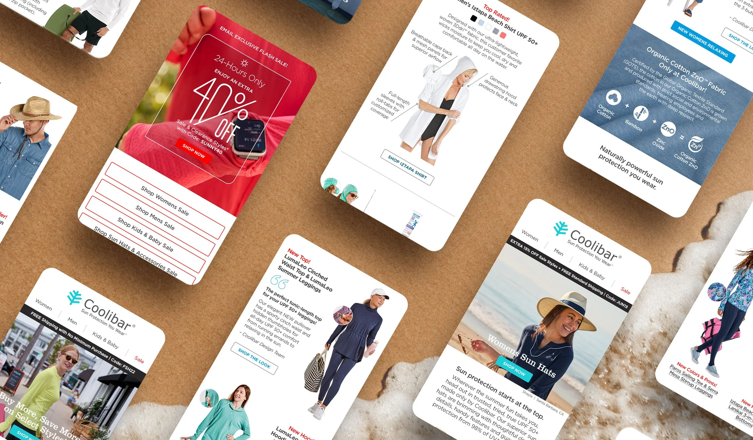
Sun-protective apparel company Coolibar® was ready to make a shift to a new email marketing platform and wanted to overhaul the look and feel of their email layouts in the process. I had the opportunity to lead the redesign and—keeping their new platform in mind—piloted updated production processes and training for additional designers. All sends are now created using a templated, module-based layout implementation, and the total per-send production time has been reduced by 50%.
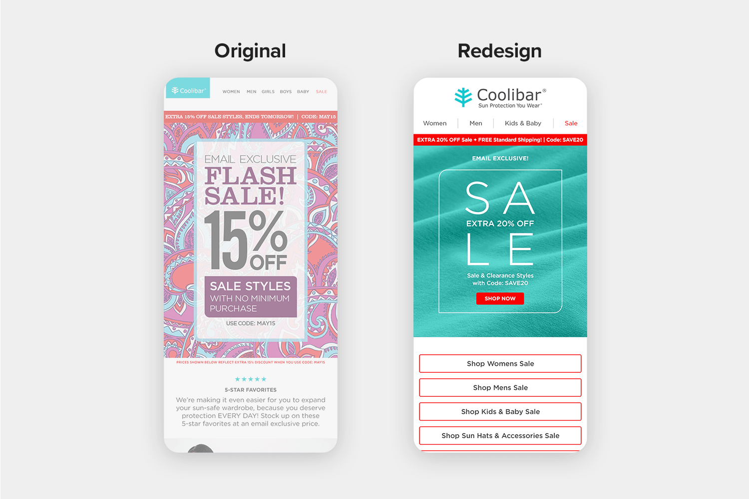
At a Glance: Light, Airy, Clean
The redesign focused on getting rid of unnecessary clutter and matching design language closer to the look and feel of Coolibar’s consumer catalog. Grey product boxes were removed, giving more breathing room to individual items, allowing for increased type sizes, and helping product colors appear more vibrant throughout each layout.

Refined Text Hierarchy
Colored elements, like quotes and CTAs, match existing Coolibar® primary brand colors and user-group Pantones. A clear hierarchy for all text was established, with the overall amount of Clarendon reduced in favor of sans-serif Gotham in varying weights. Keeping readability in-mind, point sizes were increased across the board.

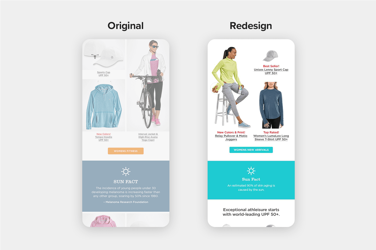
Established Sizing Saves Production Time for Designers
Standardized image widths were developed based on the type of product (i.e. bottoms, tops, brimmed hats, etc.) with size relationships proportional to one another. This allows any designer to much more quickly place an attractive array of product images when building layouts.
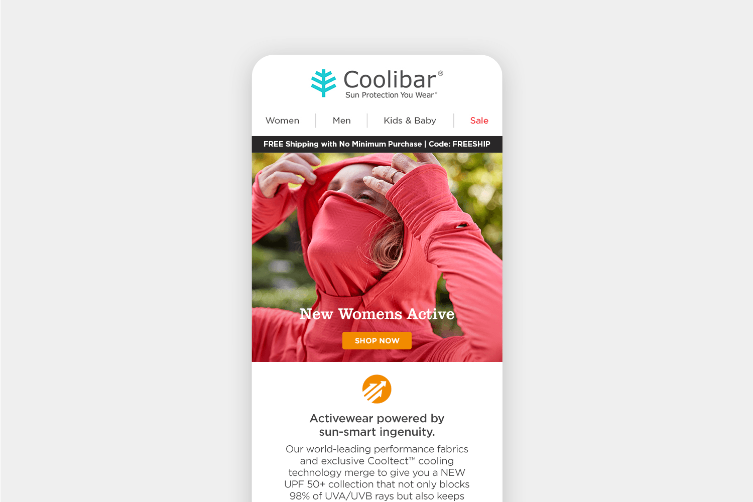
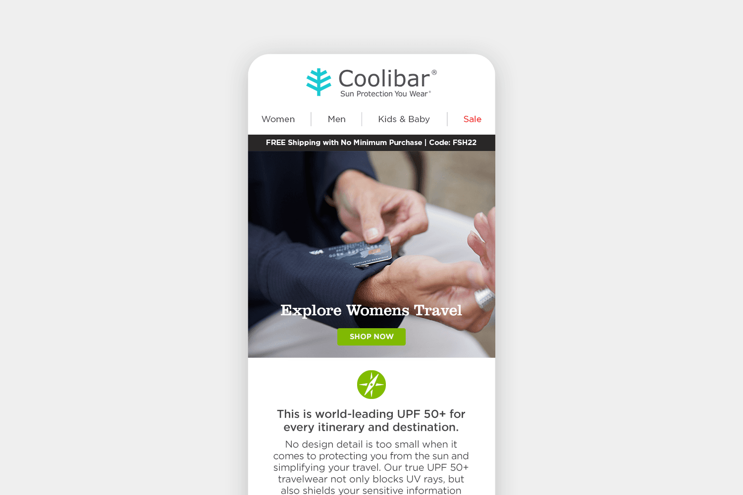
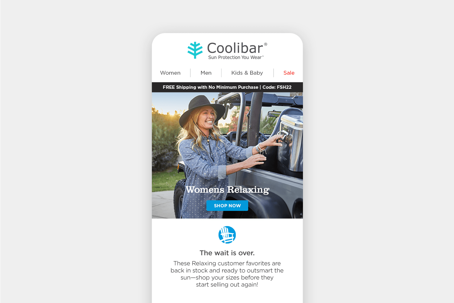
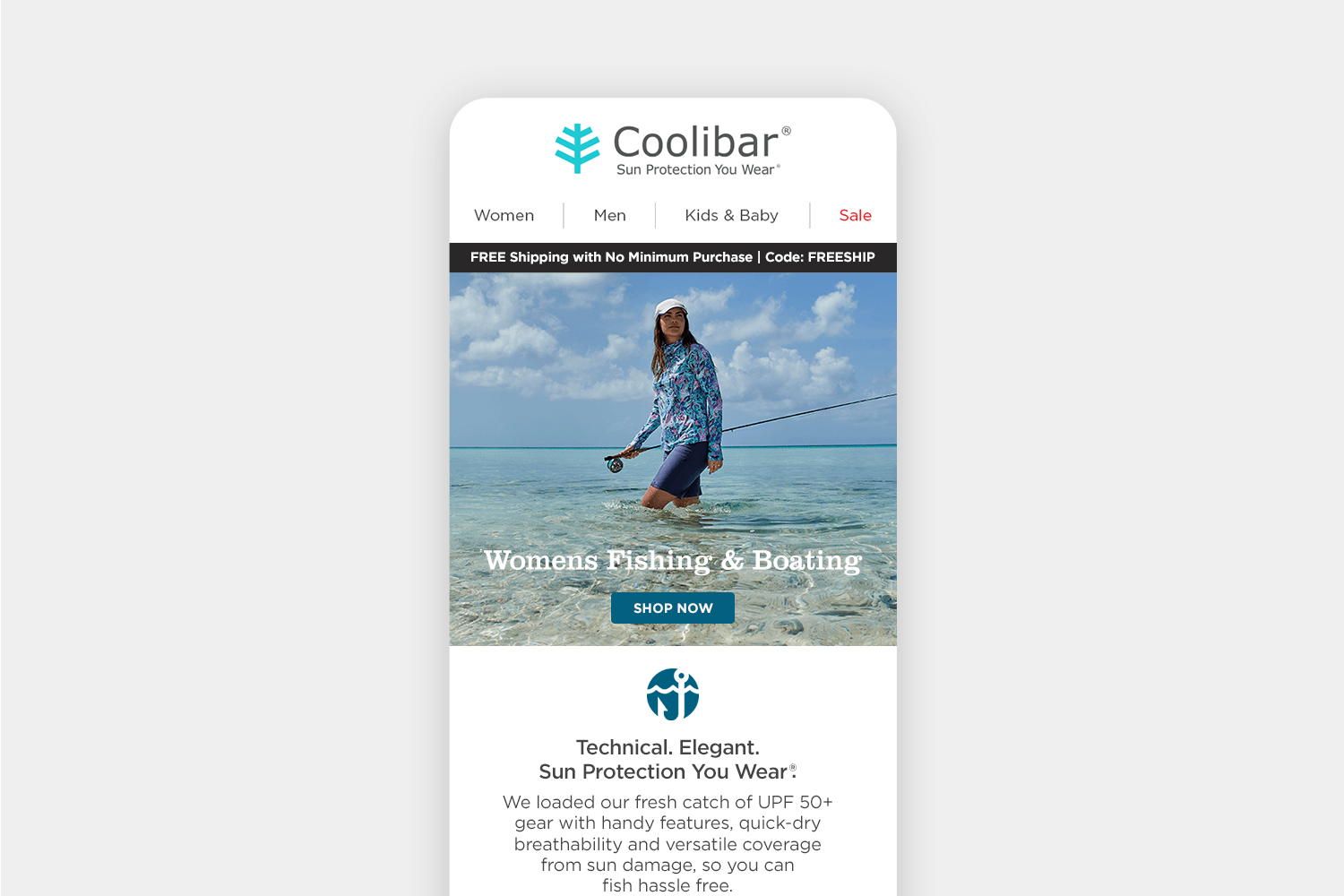
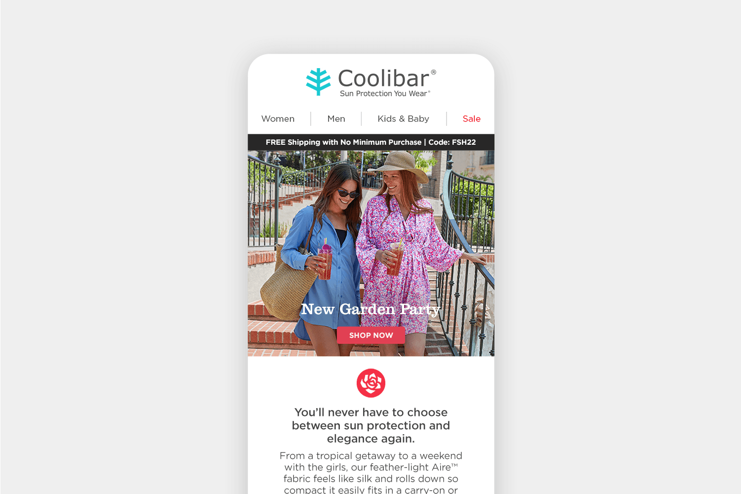
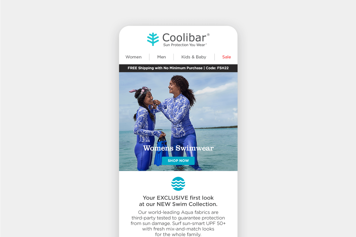
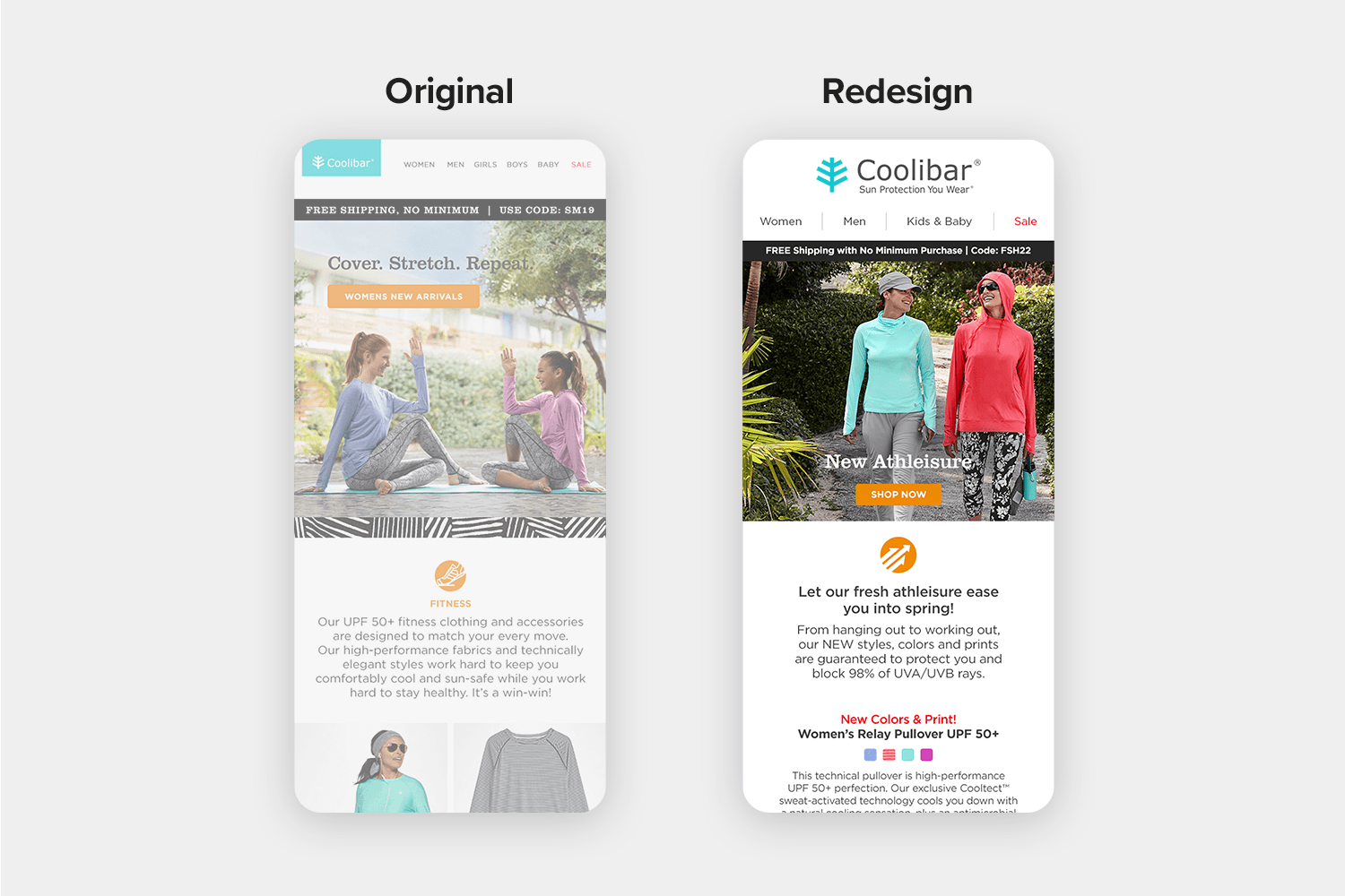
Familiarity Above the Fold
All standard merchandised emails begin with this templated module. Above the photo, the promo bar contains the current ongoing promotion and code. Above the button, the H1 text notes the primary merchandise category for the send. The color for the button and user-group icon always matches back to the corresponding user-group or primary brand color.
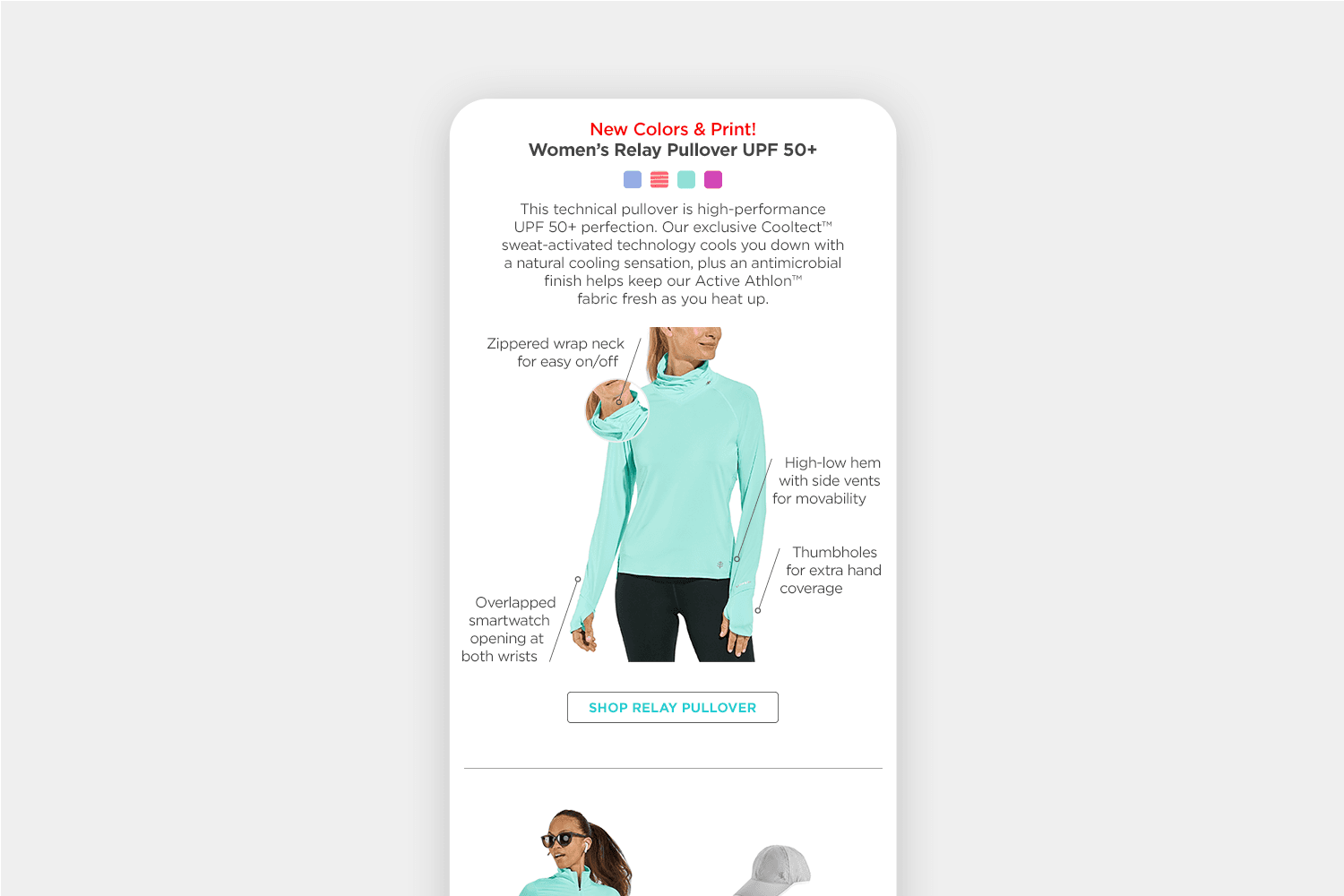
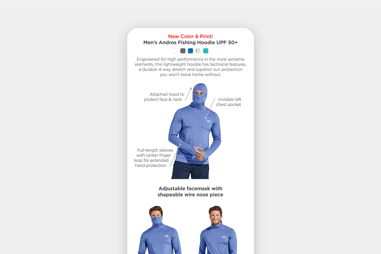
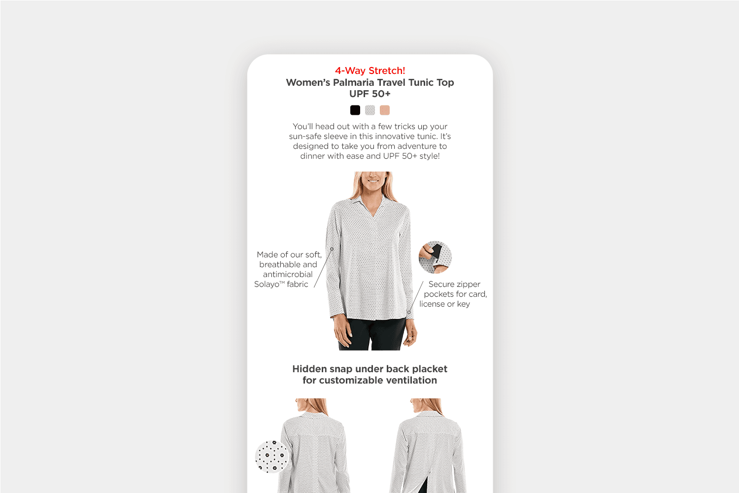
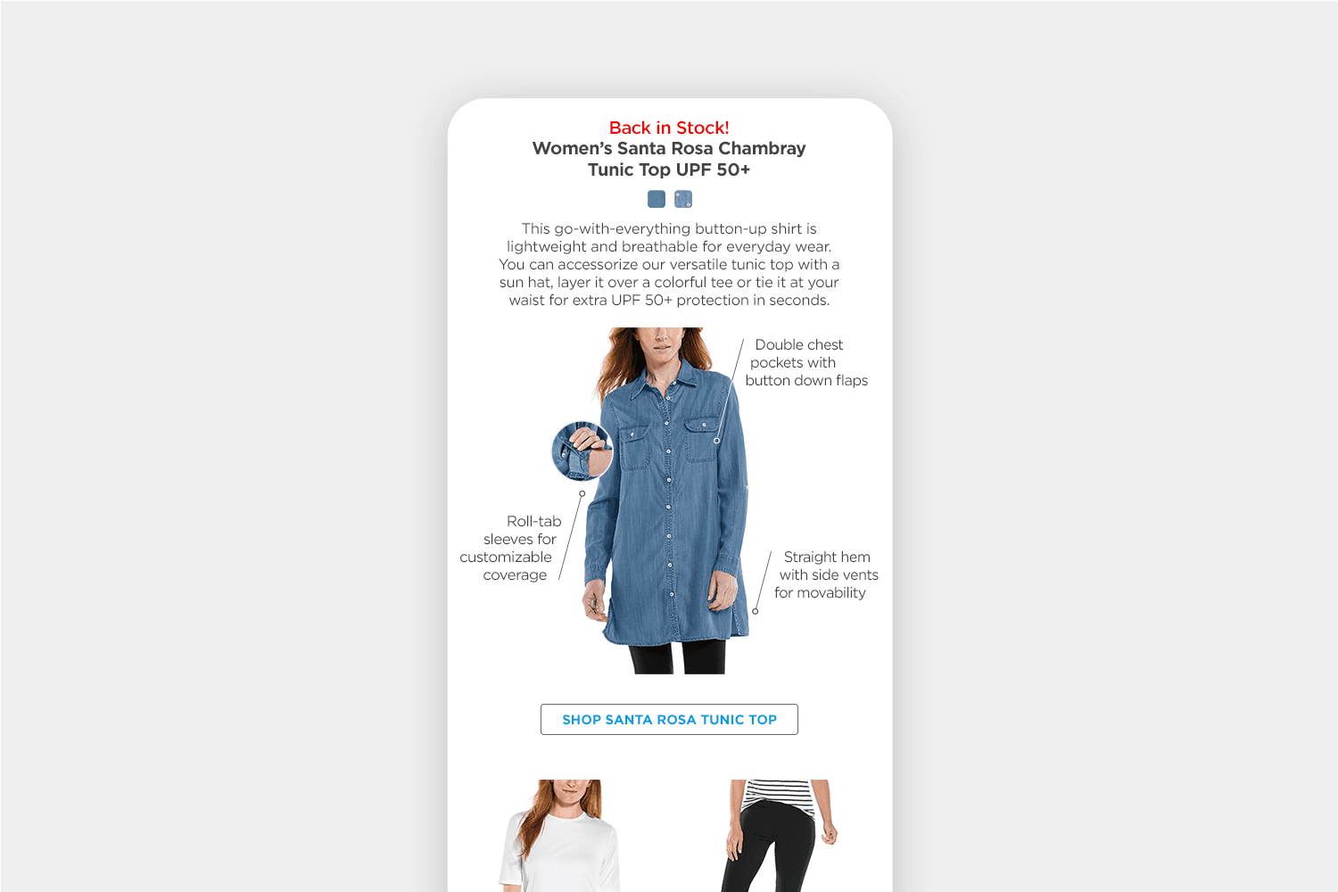
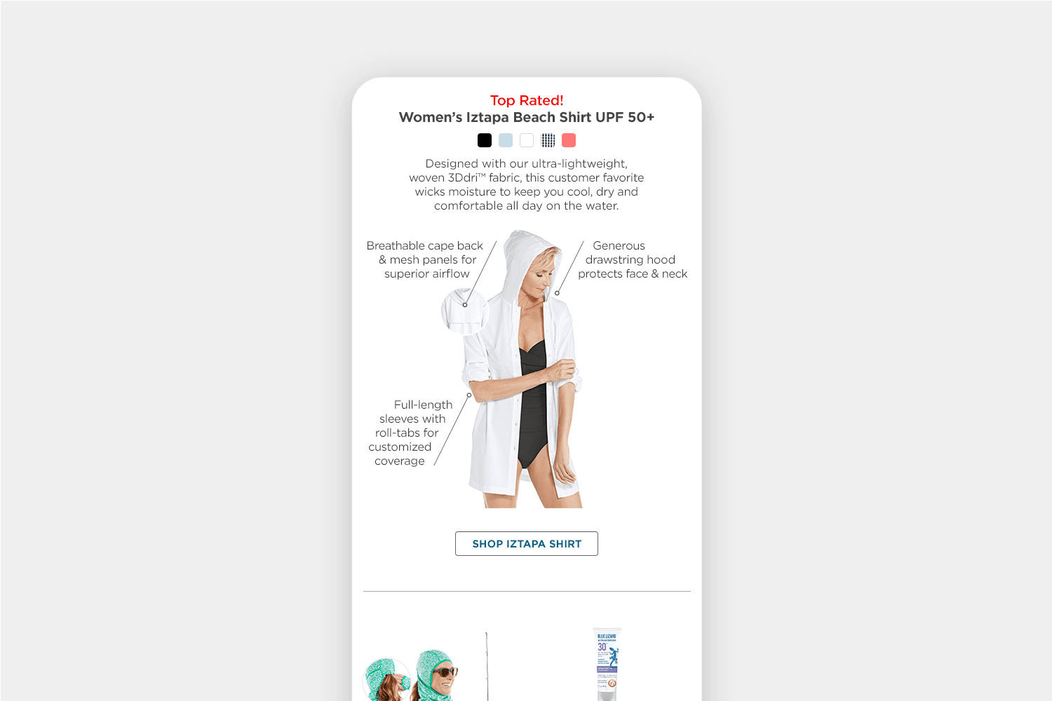
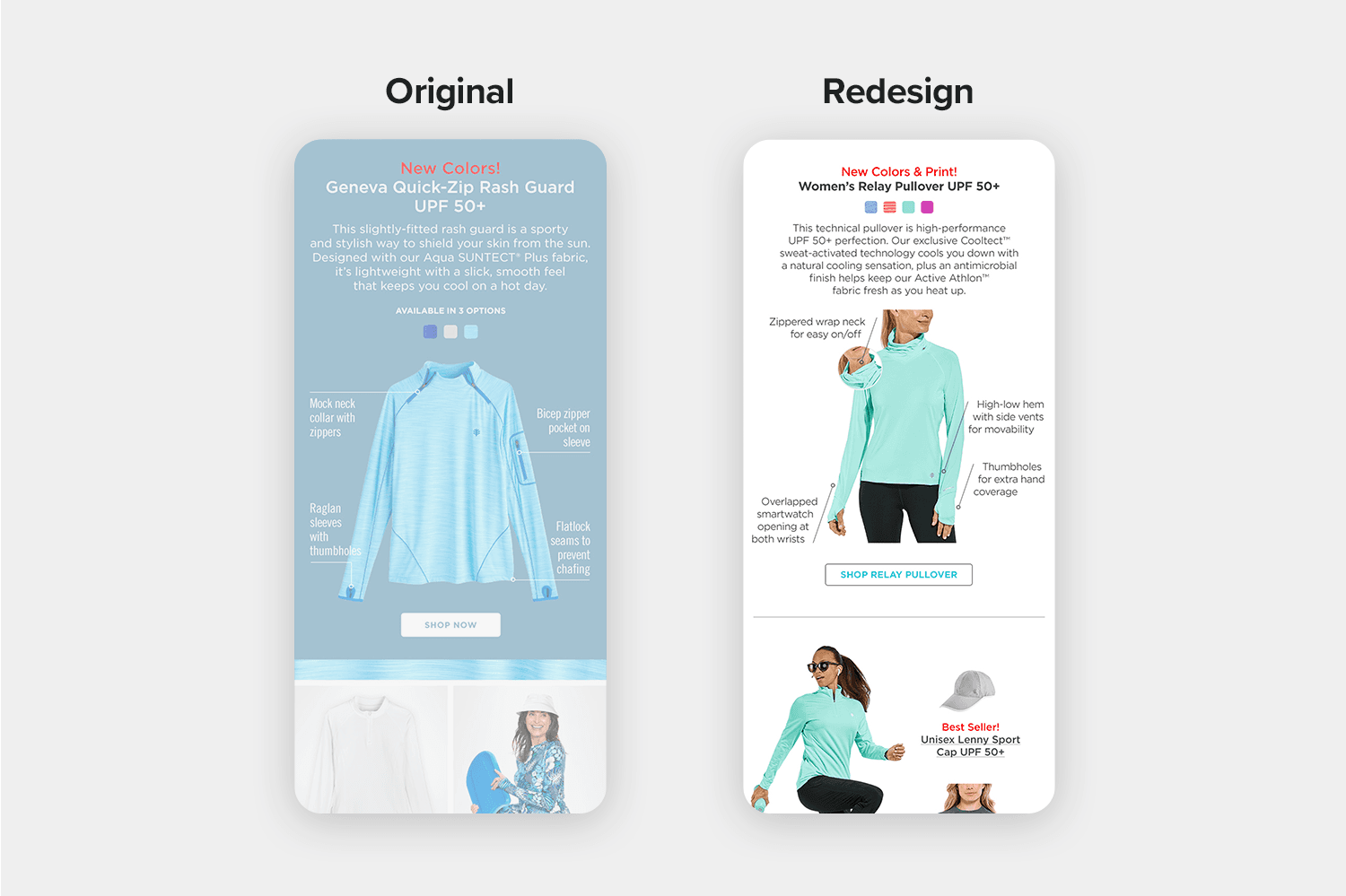
A Dynamic, Feature-Rich Focus
Technical callout modules were updated to match their catalog counterparts. Angled labels and text evoke motion while circular pop-outs show additional features and print/pattern details. Button text matches to the corresponding apparel-user or brand color.
A template group was created to maintain scale relationships and now, with each seasonal collection launch, channel-specific variations are created for email, product pages, social, and marketplace.
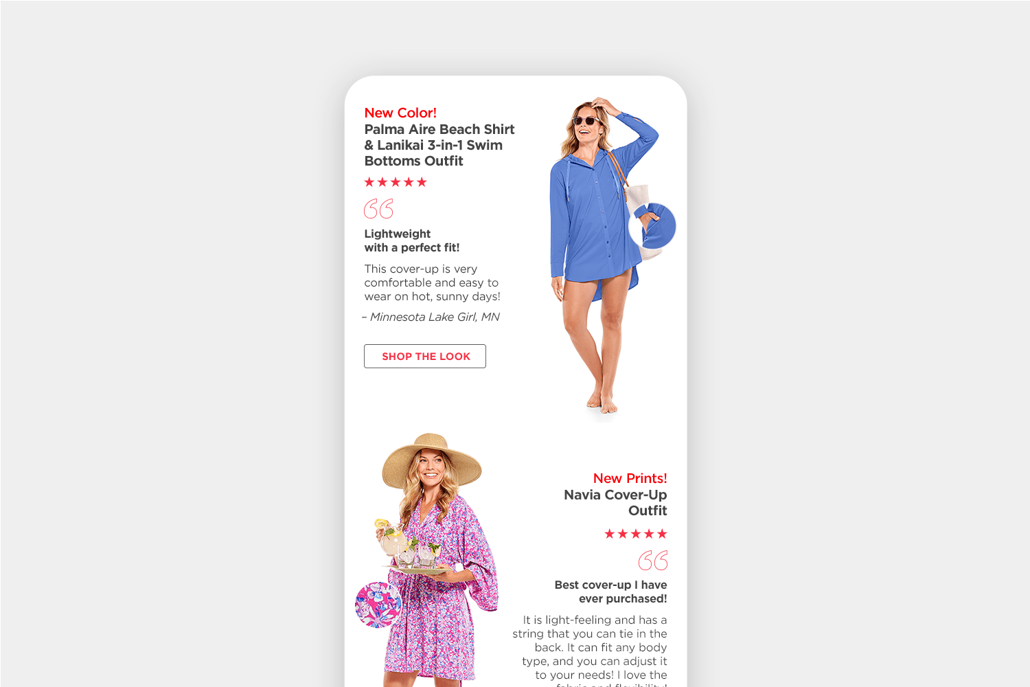
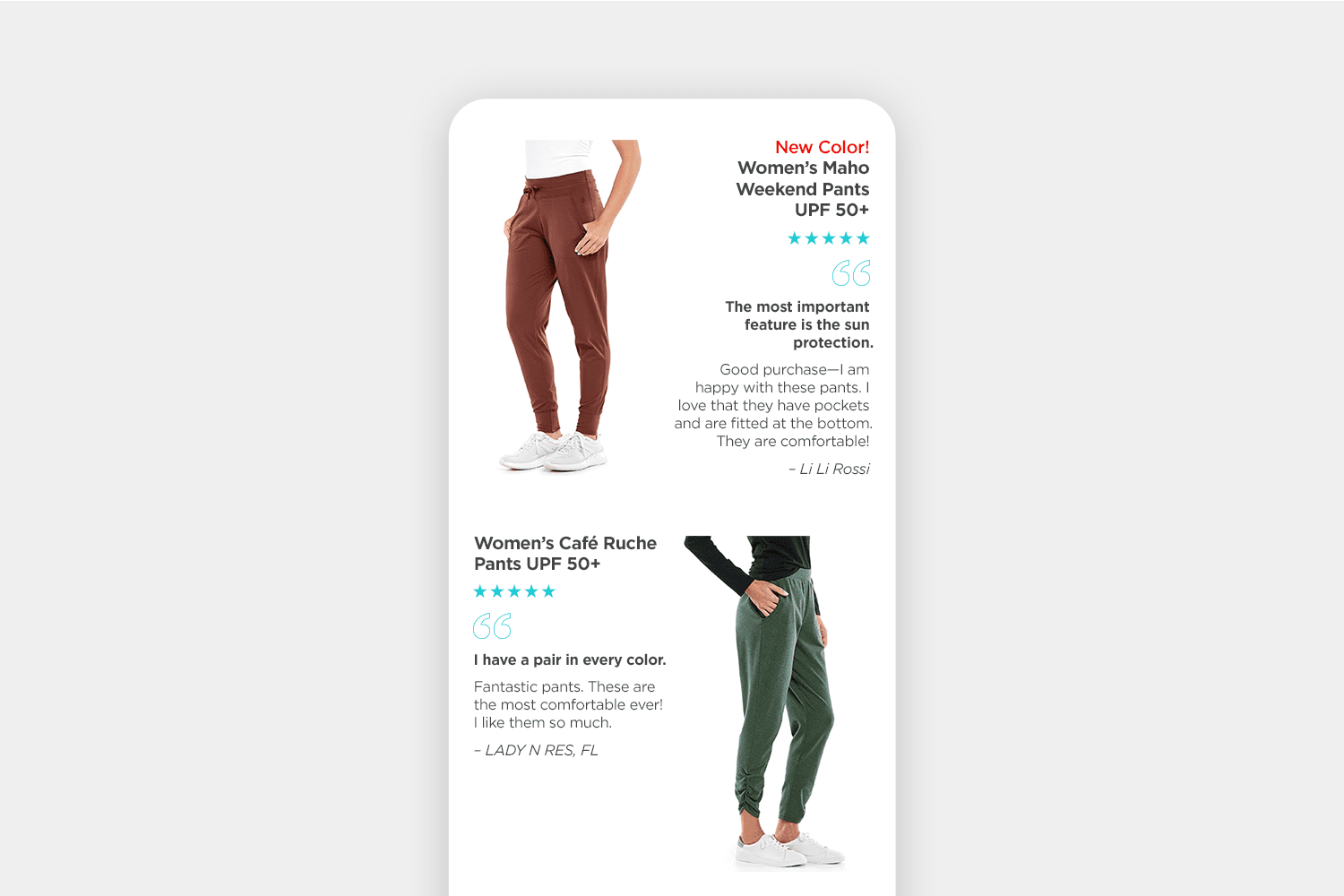
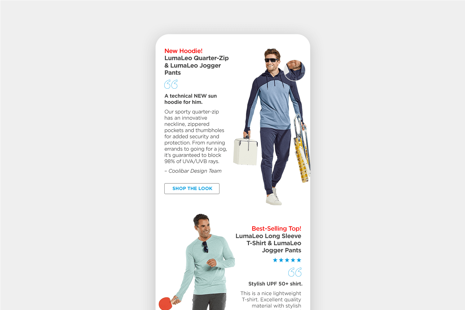
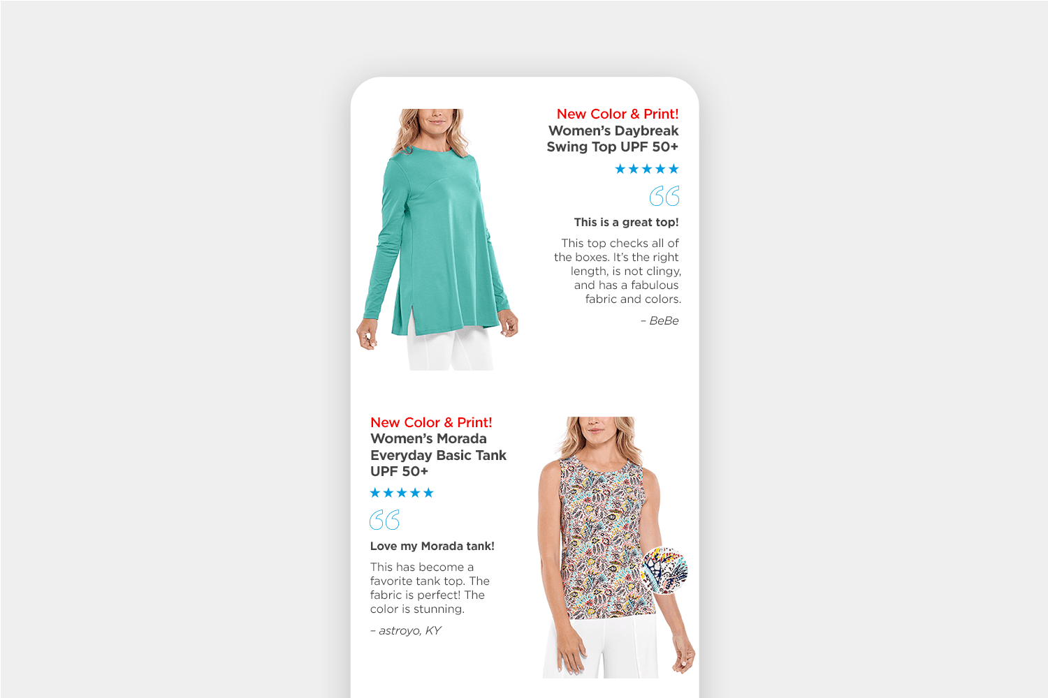
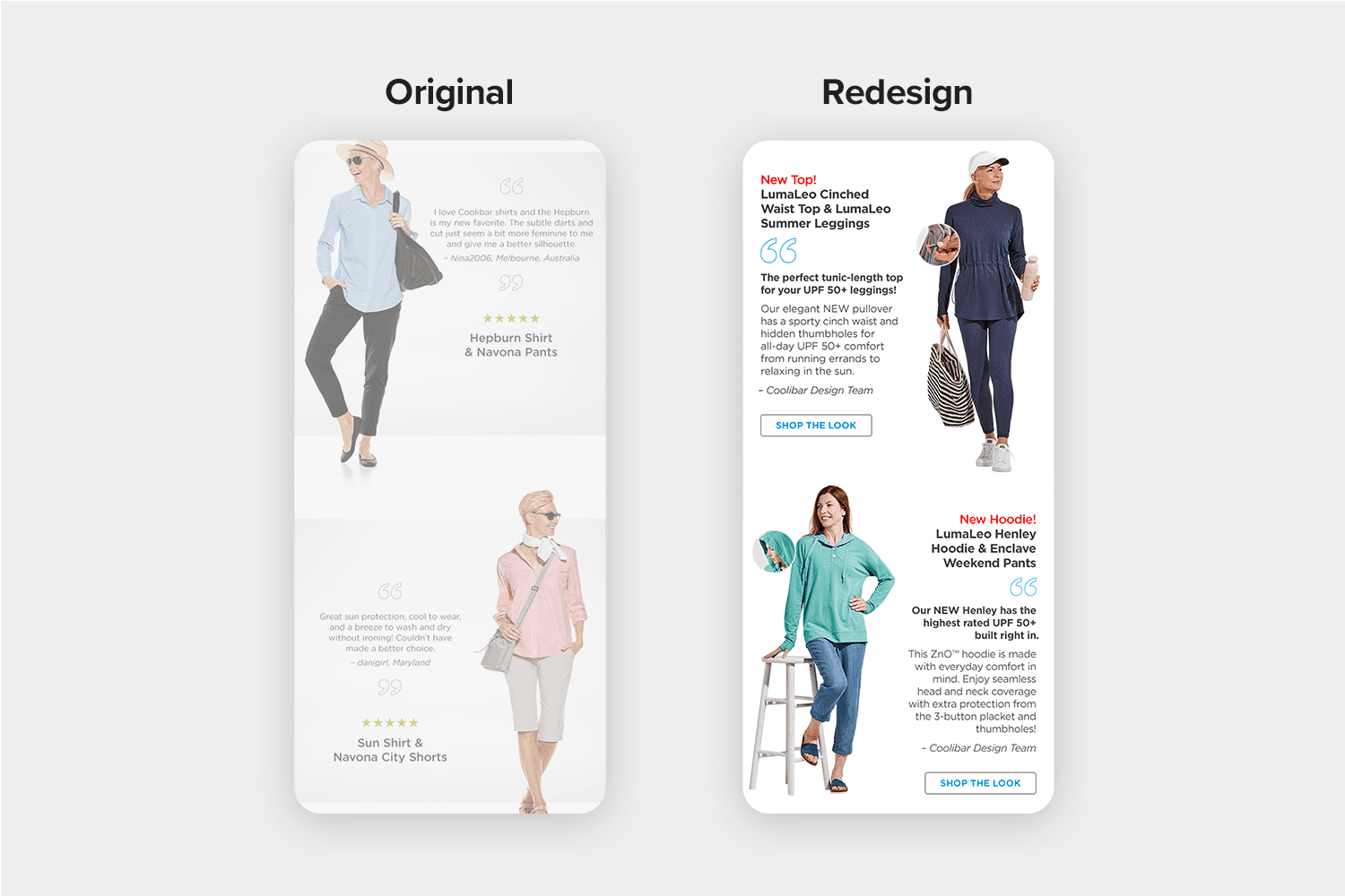
Five-Star Readability
Rather than centered, product review modules now display left- or right-aligned. “Shop The Look” CTA buttons were added to Looks We Love outfits, and all colored elements match back to their corresponding apparel-user or brand color.
Creative Direction: Elizabeth Mullen
Merchandising: Roxanne Ryan
Copywriting: Maddi Glaeser