Art Direction
//
Logo & Identity
//
Packaging Design
//
Copy Writing
//
Product Photography
//
Production
//
Art Direction // Logo & Identity // Packaging Design // Copy Writing // Product Photography // Production //
Chado Natural Teas
CLIENT: Concept Beverage Brand
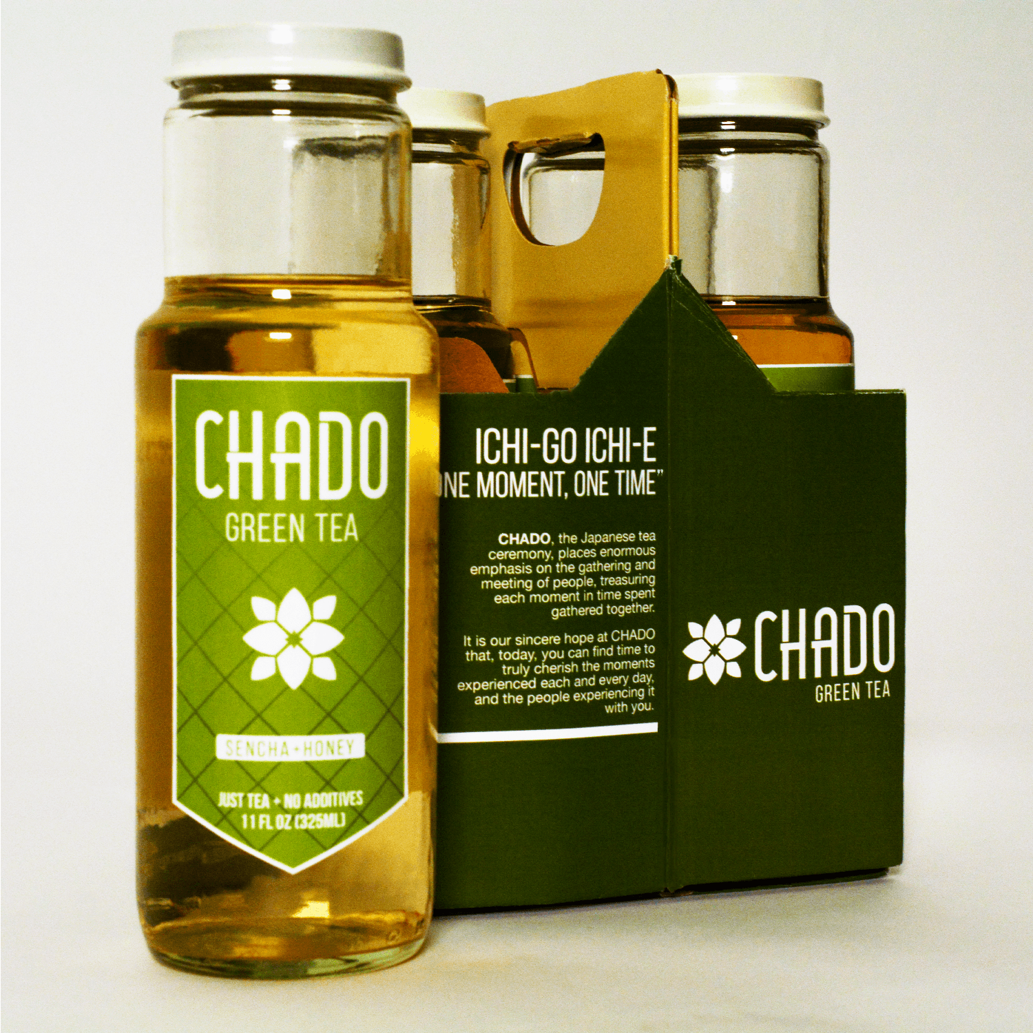
Chado is an English pronunciation of the word for the Japanese tea ceremony. The brand’s aim is to bring a more traditional style of tea to the American market, free from the intense sweetness and extra flavoring often found in commercial teas. Like the tea ceremony, Chado Natural Teas emphasizes the coming together of people in one moment and one time, and in those moments, cherishing togetherness.
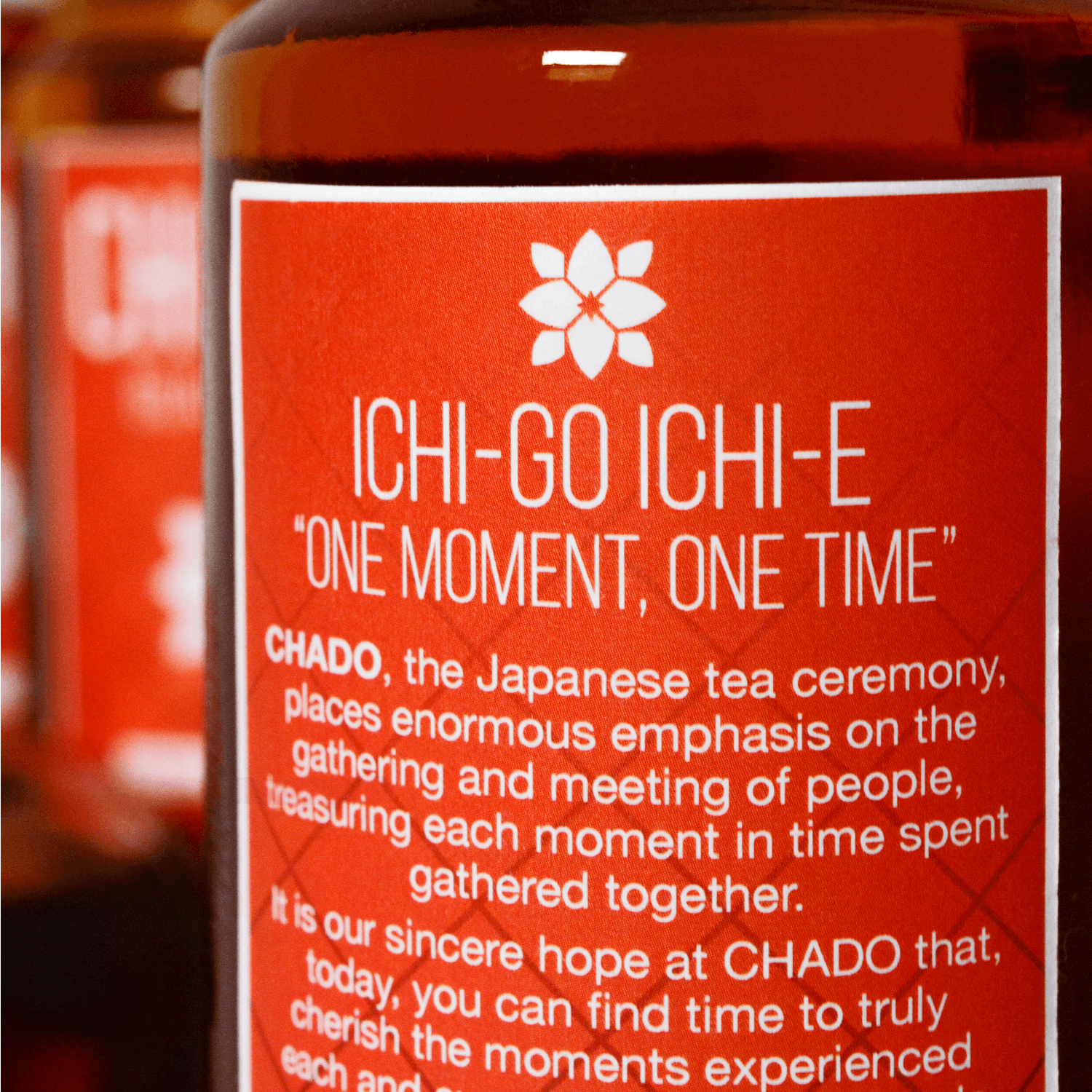
Ichi-go Ichi-e: “One Moment, One Time”
The Japanese tea ceremony places enormous emphasis on the gathering and meeting of people, treasuring each moment in time spent gathered together. Oftentimes, the phrase “One Moment, One Time” is hung on the wall of the room where the tea ceremony takes place. Chado wishes to bring that sentiment into focus in people’s every day lives.
Research/Inspiration and Mood Board
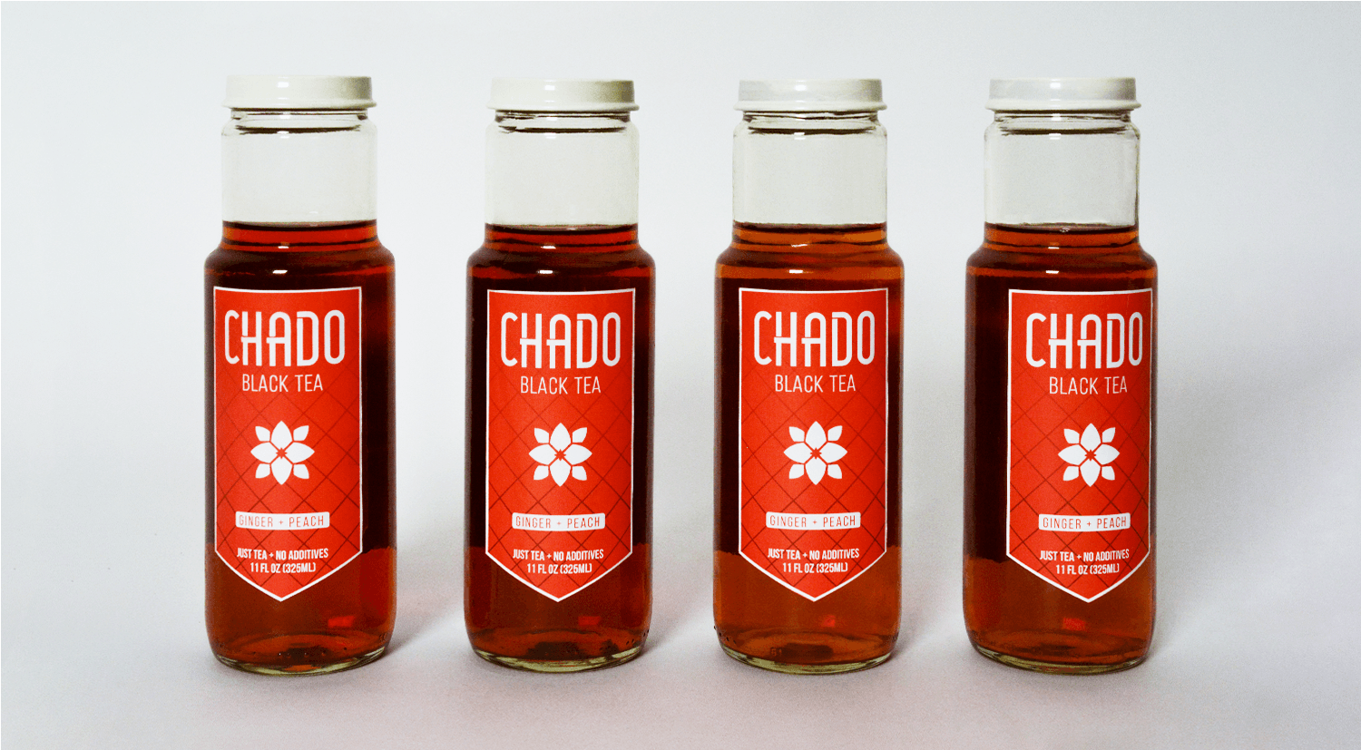
Similar to other tea brands, the natural color of Chado’s tea is showcased by its bottle, which is made of glass for a purer taste and premium feel. The brand, label, and carrier colors were chosen to complement the natural color of Chado’s green and black teas.
Initial Logotype Exploration
Refined Logotypes
A Clean, Custom Logotype
The Chado logotype utilizes a custom sans serif that is friendly, flat and clean while evoking an eastern feel with its selective breaks and extensions. Subtext is set in Bebas Neue, which complements the logo’s condensed letterforms in a refined light weight.
Initial Logo Mark Exploration
Refined Logo Mark
A Mark that Stands Alone
Initially, I had envisioned a more illustrative logo that drew its form and figure from elements of Japanese culture. However, as the brand developed, it was clear that a clean, flat logo that emphasized tea itself, rather than Japan, would be needed.
Other brands often focus on the leaves of the tea plant. The final Chado logo mark is instead a minimal representation of the flower that blooms on the camellia sinensis tree—the plant from which almost all teas are processed.


